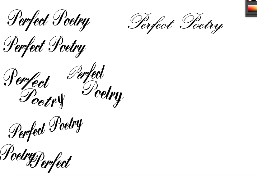
The idea for this company is to show home made skill. I started practising with pens and ink, however my skill still isn't very good and decided to use a digital font for the redesign. This way the logo and can be used on many different digital platforms and is easily useable.


There was a lot of experimentation with the typeface. Script font is the normal choice for poetry, but I thought this was a bit dated and with Perfect Poetry it needs to excite the modern consumer looking for a bespoke gift. There has to be movement and rhythm wihtin the logo and branding to emulate poetry. This typeface was not working for these ideas.


No comments:
Post a Comment