This module has been a really interesting module and
probably my favourite so far in the course. It has been a really good
experience to work on a lot of live briefs. The competitions are particularly
exciting because there is a chance to be involved in the professional world.
However, the YCN and D and AD briefs were a bit hit and miss. Starting
with J2O was at first exciting and really good fun, but leaving it for so long
meant I was really bogged down when getting back into it. I built it up in my
head far too much and made the problems I was facing a lot bigger than they
were. The reality was that the brief was a bit corporate but it wasn't as
restricting as I made myself think. Now looking back five months later, there
was a lot more I could of done. I think things like that you only learn during
or after the event. Doing briefs for people I know wasn't as hard as I thought.
I think this is because I was keen to design for them. I saw that Perfect
Poetry needed a new look in order to get more custom; so being asked to do it
was good. I am really disappointed that my hand rendered type still isn’t any
good or that I’m not fast enough to use on a design. I think with this problem
it still takes time and a lot of practise. It would of been a lot better in terms
of the design and concept if I was able to create something decent. Since I
used a digital font I felt like I was contradicting myself. FEATHR and Secret 7
were fun little briefs that didn't take up too much time. It's really
refreshing to work on something a little more light-hearted in-between these
bigger briefs. The briefing for FEATHR was really good and encouraging, which
made me get an idea quick and work on it solid for a while. I prefer
working on things with a strong concept, although these briefs have shown me I
still don’t research enough. I still struggle with the idea of research and
what good useful research is. Working
with someone on one brief was actually quite good, I think this because me and
Katie are similar in work ethic. However, that can be bad because we were very
slow to start PANTONE. If we work together again we both have to be very keen
to star the work. I think possibly it would better if there were someone else
to keep us both on track. Working for client was a new experience because there
was always someone to talk back to and talk about your work with. Making sure
they are happy is the most important thing.
I think for next time working with clients I would try to be more
professional about it so that it felt a lot more real. Overall with this module
I have learned to really read the brief and understand what I am supposed to be
doing. Working with others, there should be a proper timeline of work and
meetings. I should not wait till last minute to start a brief. Although time management
was a problem for this module I think a lot of it was because there is so much
other work to be doing outside the module. I found it difficult to keep up with
doing Responsive briefs, as well as other modules’ work. This is obvious to see
in the time I have spent on some of my briefs. Finally to understand what
research is and how to do useful research that would inform my designs.
Wednesday, 25 March 2015
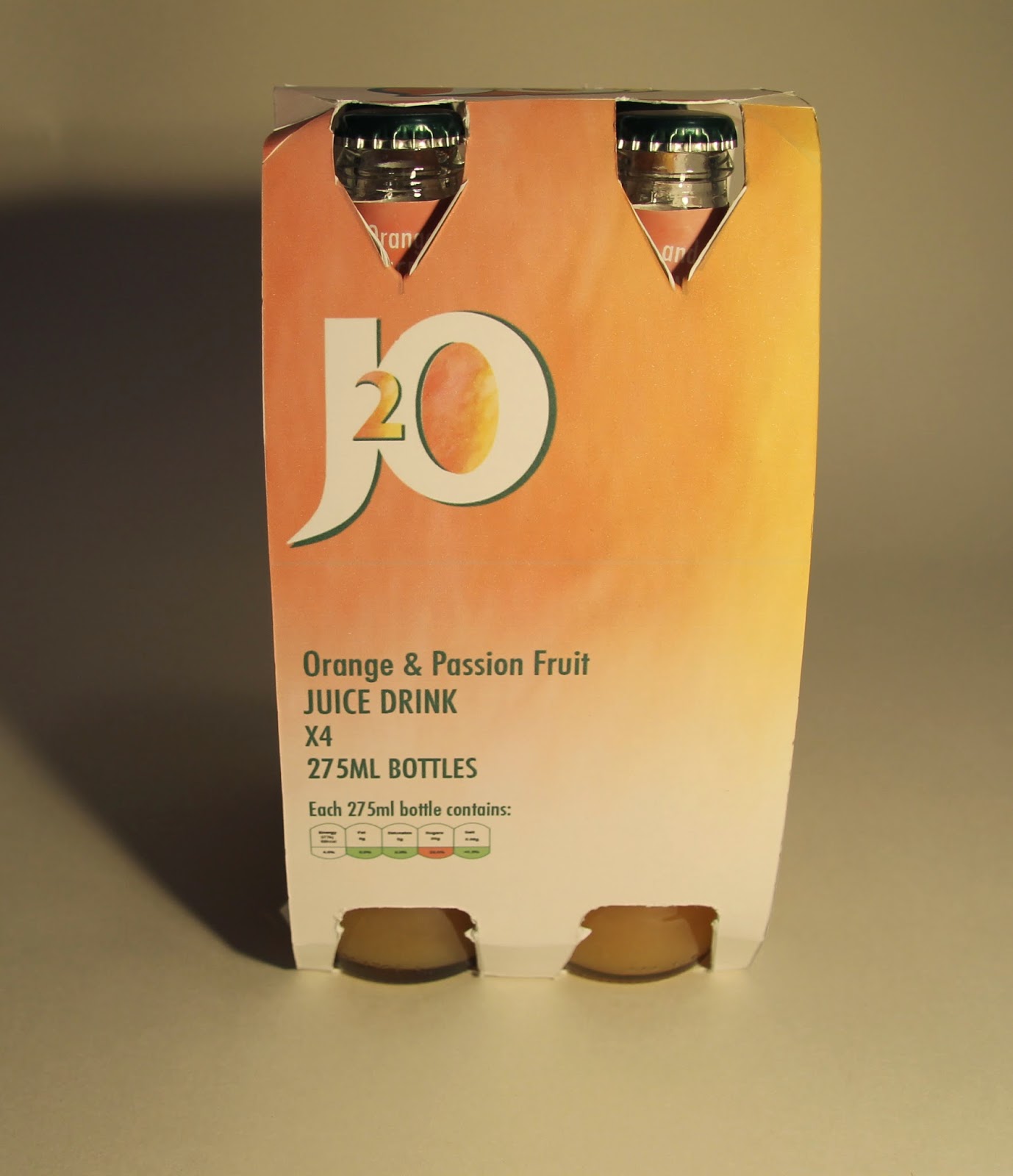
Responsive - Evaluation - J2O
The J2O brief was a lot longer and more difficult then
I could ever imagined. The only reason it was so hard is because I left it for
so long. Rather than developing and finishing the design when I still caught up
in the process. Now I see this brief with some hatred. At the beginning I
really enjoyed working with the colour scheme and totally changing what J2O
looked like. Although this wasn't really in the brief. I definitely strayed
away from the brief because I thought it wasn't that good. The fact you had to
keep the logo and that green really annoyed me, I think I let this get to me
too much. I should have jut read that, then see what else there was to do.
There was still the whole background and colour scheme of that i could work
with. Having said that, I think I have given J2O an appropriate redesign, the
logo is still obviously J2O, the colour green is still there but just more
subtle. I like what I have designed but think I should of thought about it
more, such as the audience. The whole point to this brief was to get more 20-30
year olds drinking J2O and I'm not sure the new design answers that. It may
encourage more female drinkers because the colours are similar to summer
drinks. Doing this brief has taught me to be very careful when reading and
choosing a brief. If I had realised how restricted it was I probably wouldn't
have chosen it. I’m also disappointed in the way the box has come out, I
wanted to laminate it so that the card wouldn’t fray when being cut, but the laminator
wasn’t working. Now there is a lowering the quality of the finish. That
normally is the case with my work. Overall with this brief I am glad it is over
and I am slightly happy with the outcome.
Responsive - Evaluation - PANTONE
This was an interesting brief to work on. Katie and I
originally hadn't planned to work on this so it was a very quick turn around of
ideas and material, which I think, worked out better than the original plan.
That plan was to do the i-D brief, however we weren't able to do our idea for a
last minute drop out. Rather than panic and think about that for ages, we just
ploughed on and chose a brief we both were interested in from the start.
PANTONE always seemed like an interesting one to do because it was very
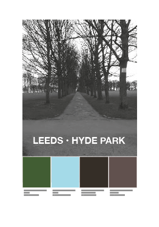
personal. We both decided concentrating on Hyde Park would be the best idea
because we both live here and know it well. We wanted to show what Hyde Park is
actually like rather than a council style glamourized version of it. We weren't
being negative, just truthful. If I were to do this brief again, I would have
not waited for so long to start it. Our time management definitely went out the
window at the beginning; this is probably because there is a lot of other work
to be getting on with. We started a lot later than we should have which in
hindsight is a really stupid thing to do. This lack of time meant our research
and development of a concept suffered. However, I think we still did well to
think of why we wanted to do this brief and understand why we concentrated on
Hyde. I think the finished pieces look really good and would work well
around Hyde Park.
Responsive - Poster Development - PANTONE
We had a discussion with Danny about the posters and it was suggested that there was still too much colour and try it with a grayscale. Taking the colour from the image will enhance focus on the colour swatches.
The pixelation idea is also a bit too distracting to have with the poster. So we have tried them with no pixilation and no colour.
Although it cant be seen on here, there is a bigger border around the image. We have changed the lines from black to white, which looks more like PANTONE. The lack of colour on the image makes the swatches the most important thing on the page. each colour has come from the image and has RGB and PANTONE colour code.
Responsive - Poster Development - PANTONE
We went through and picked the four images we think best represent Hyde Park. From there we pixelated them, some of them with brighter colours seem to work better. But because there is a range of colours it will look better when the colour swatches are applied.
.jpg)


Once the back image was sorted, we concentrated on the type and colour. To connect the branding to PANTONE we used the same typeface and weighting. This allows the creative people of Hyde Park to recognise the company involved. However the logo will be used to further this branding.

This mock up was an experiment to work out how to use the type and colour. With black type it is difficult to read, by putting the white box with thick black outline it relates to back to PANTONE. However this is far too busy for a poster, there's too many boxes and squares.
We worked out the layout for the rest of the posters, which look better. However, the colour swatches don't stand out as the most important thing which is what we were trying to do.


The white type works a lot better than the black and white box. Centering it as well brings the attention to the swatches and the area name. However, there is a lot of colour on the poster, which takes away attention from the PANTONE branding style swatches.
Responsive - Poster ideas - PANTONE
We want to create intrigue and interest with the residents of Hyde Park. So by not having a lot of information on the poster itself, it should make people want to find out what it's all about.
We want the colour to be the most important part of the poster, so by making the image hard to see it will bring focus on the main element of colour and Pantone.
We experimented with blurring and the pixelating the image.

.jpg)
We want the colour to be the most important part of the poster, so by making the image hard to see it will bring focus on the main element of colour and Pantone.
We experimented with blurring and the pixelating the image.
Blurring the image seemed to dull the colours and made it difficult to look at it for a while.
Pixelating the image seemed to work more because the colours are separate. The pixels also remind us of the pantone swathes. Whether it be too much needs to be figured out.
Responsive - Photography Development - PANTONE
When we looked through the photos we discussed what we could do with them to incorporate PANTONE. PANTONE are known for their swatches, the simple squares of colour with in the information at the bottom.
We wanted to simulate this with the photos. The best way to use the photos will be in a poster format. This way they can printed at different sizes and posted around the Hyde Park area. There are a lot of posters in the area and they are very good way of promoting. Since these posters are about the area and not about an event that Friday night, people will look at it.


We wanted to simulate this with the photos. The best way to use the photos will be in a poster format. This way they can printed at different sizes and posted around the Hyde Park area. There are a lot of posters in the area and they are very good way of promoting. Since these posters are about the area and not about an event that Friday night, people will look at it.
Responsive - Photographs - PANTONE
We knew using photography was the best way to show the public Hyde Park, this way it is honest and true. Photography is the easiest way to visually demonstrate what Hyde Park has to offer. The places we're looking at are definitely from a students point of view, however residents will be able to relate to these images as well.
From these images we will select a group of them which represent Hyde Park well and all its elements.
.jpg)
.jpg)
.jpg)
.jpg)
.jpg)
.jpg)
.jpg)
.jpg)
.jpg)
.jpg)
.jpg)
.jpg)

Responsive - Ideas and Discussion - PANTONE
Once establishing that we want to concentrate on the current living area of Hyde and what is has to offer we jotted down the important places to visit and things to look at
Hyde Park Picture House
Hyde Park
Back lanes
Wheeley bins
Pathways in the park
Tiles on the roof, and rows of roofs
Graffiti
Flyer Boards
Main Roads - Brudenell Road, Hyde Park Road, Victoria Road
To someone living in this hometown, all of these things and places we are looking at represent Hyde Park. We want to show the true area rather than glamourising it till it looks fake. We know we don't want to create a campaign that doesn't suit the area.
Responsive - Research - PANTONE
We had to change the brief very last minute which was really difficult. We were going with i-D but out plan had fallen through, so it was easier to change the brief and think of a new idea.
Me and Katie read through the PANTONE brief and began with a brain storm of ideas. Because we are similar our ideas were all good for us, it was a simple evolution to get the final idea.
We decided to concentrate on Hyde Park because we both live there and know it well. We know what residents will recognise and what are major 'landmarks' or important places in the area.
A simple google image search of Hyde Park presents it with a lot of red brick houses, images of the park and lots of roads and terraces. This is exactly how we both see Hyde Park, the park being to the side of the area, all the rows of houses, tiles, wheely bins lined up is interesting to look out.
Upon other research, I looked at the the odd history of leeds. There is a long history behind the city of leeds, but concentrating on the city does not apply to us. We want to make people interested in the housing area more.
Old subways in Leeds City centre. Not applicable to this brief or what we want to concentrate on.
An old bear pit. This building has intrigued me because it isn't far from where I live. It is interesting to find out what that is, unfortunately that is in the past. This brief is about concentrating on the present and the future, encouraging people to look at Hyde Park now.
Tuesday, 24 March 2015
Responsive - Finals - J2O
The final boxes were difficult to cut. The design was printed on a thick paper, which was not suitable. Getting it printed on a 400 GSM stock worked a lot better, although it sacrificed some quality when being cut. The layers sometimes come away, and show the white parts which is very annoying because it takes away from what the finished piece should look like. The plan was to get it laminated as well so there was a shine to it, like the original packaging, however that wasn't possible as the laminator wasn't working.
If I did this project again, I would have planned a lot more in advance how it was going to be printed so that the quality of finish didn't let it down as much as it has.


If I did this project again, I would have planned a lot more in advance how it was going to be printed so that the quality of finish didn't let it down as much as it has.
Saturday, 21 March 2015
Responsive - Evaluation - Perfect Poetry
Originally I thought this brief would a good one to
work on for my hand rendered type. I bought a pen, ink and practised for
a few days. As there was other work going on I definitely didn't practise
enough, I still struggle with forming letters the way I want to. So
unfortunately I had to use a digital typeface. This annoyed me because I don't
feel like I am developing my hand type skill due to amount of the work.
However, once I had picked a font I liked it because it wasn't an obvious
choice of a script font. This was more of a hand written typeface, which is
good because it demonstrates that Perfect Poetry is a very handmade company.
There didn't have to be a visual element to the logo but I think using the
lines of white over the blue shows that this is a creative company dealing with
poems and rhythm. There was a quick development of what promotional material
was needed, after redesigning the Facebook, Twitter and website I realised that
printed material is really important since this is a local business first. it
was fun to work out what else was needed like the form, small flyer and my
favourite is the postcard. I thought this would be a really good way of quickly
getting in touch with Perfect Poetry before having to find them online. I think
all the work that has been made has a strong brand identity and flows together
well. The printed material works well to involve people and get quicker
responses from clients.
Subscribe to:
Comments (Atom)