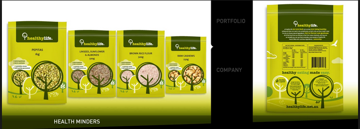
Don't really like this, the green is very bright and doesn't suit an organic product.
I like the illustrations though, think they're quite appropriate to organic foods.


A lot of companies use quite simple design. I quite like this because it makes it seem clean and pure, like organic foods. However, I do want to use hand rendered techniques but probably will use only two or three colours.

The vintage look will probably look quite good for 'Grandma's Sauces' because of it being an old family tradition. I'd like to show that in the design.


I thought of graze straight away when I picked 'Granma's Sauces'. They have a really simple but clever design idea. However this sort of style is not what I want to do for the company.
No comments:
Post a Comment