Tuesday, 4 February 2014

Studio Brief 2, What is a book?

We had to bring in 15 questions about type, legibility and readability and colour theory. 5 on each.
As a group of 4 we then had to discuss them and use them to make a top ten question list.

These questions had to be ones we could research well and talk about a lot because the research will be the content of 10 double page spread layout book. 


We separated the questions into the three categories and chose which ones we wanted to research. 

I chose 'What are the main anatomical features of signs' and 'What are differences between type face and font?'
I will research these questions and bring back sources and quotes etc for the next session.

Because there was four of us and ten questions we decided to pair off and do one of the last two question together.
Aimee and I did 'How can type be arranged correctly'


What are the differences between type face and font?

A typeface is the design, the shape and style that flows through all the glyphs. It's the overall design that makes that letter form or glyph identifiable within other fonts.

A font is the digital version of the typeface. It's the piece of software that's made for the computer. 

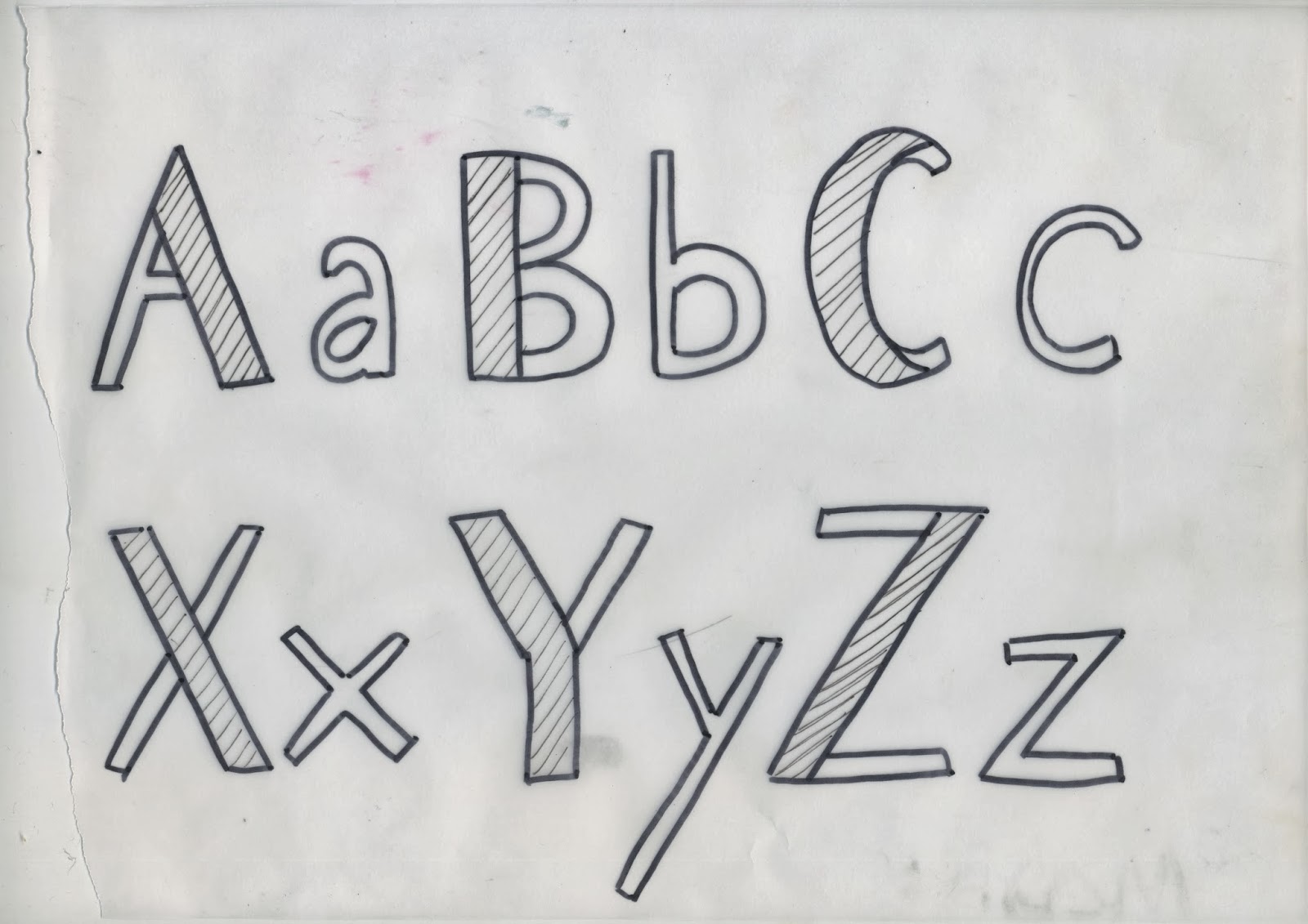
What are main anatomical features of type?


This image shows the full glossary of the anatomy of type. However the main and most important ones are;

Counter - The space within in the letter 
X Height - The height of the lower case letters
Base line - The line the letters sit on
Cap Height - The highest point of the letters, where the stem                  stops also
Terminal - Where the letter stops
Cross Bar - The bar within the capital A and e
Serif - The bracket that is on some fonts
Lobe - The loop of g's and such letters
Ascender - The line of a letter that goes up
Descender - The line of a letter that goes down
Stem -The longest line of the a letter


Monday, 3 February 2014

Type Journal, 10


I wanted to put my own typeface in here because its type and I have been working on it, so would work well for a type journal piece.
I started with Times New Roman and started by thinning down the thicker stem. From there I played around with style but decided to add the lines in between the gap to add detail and interest. 
Im quite happy with the final outcome but if I'm going to use it as a real typeface I would sharpen up the lines and make it less hand rendered and more digital then this.

Design Principles, Font Families

Design and type are all about pushing boundaries and trying to create new things. With type you have to think about how far something can go before it becomes unreadable and ineligible.

How bold can bold be?

How light can light be?
How sheer can italic be?

With italic the sheer is the lean on the letter. Normally the sheer is 12 degrees, but I can experiment with how far I can push that and see if it works.


I started with Times New Roman and manipulated it quite simply, but cutting the thick section of the stem down by half.


After working with these in the four types of font I decided that I hadn't gone far enough with the manipulations as they looked pretty much the same.


LIGHT 


BOLD


REGULAR


 ITALIC


FURTHER DEVELOPMENTS


These developments I think are still too safe. They still look like the Times Roman far to much and I think need to change it more. I found it really hard trying to create the italic fonts with trying to make it look right, the C is probably the hardest letter, because of the curve.
So I went back and worked on the original ideas and then how I could change them.

I wanted to make more of the thick stem that is associated with Time Roman. I think it was important to keep that in but update it and change it around. I took the fill out and put lines. I always like adding small details so think this works quite well. I liked the final version I created and decided to go with that and change it from regular to bold italic and light.


These were the original sketches I scanned in to make into digital. I chose to keep the thick stem to keep the idea of where the typeface originally came from. I chose to put lines in between there because I always think detail is quite interesting and thought it would look good in a typeface.

These are the final digital ones I've created using live trace on illustrator and photoshop.


I like the hand rendered element the live tace has left, it shows that I have actually personally thought about these letters and drawn them.


I went for quite a harsh shear at 15 degrees to make it obvious it is italic, a lot of the time I find you can't really tell it's italic until it's next to regular fonts. So this way it is obvious its italic and I enjoyed pushing boundaries.


I think the bold hasn't worked that well because of the lines in between the gap of the stem, however I still like it because of the hand rendered style. I would change it to a tighter shaper type if I was going to use it at some point.


Friday, 31 January 2014

Colour Theory, Pantone Matching

Objects


Yellow Selfridges bag

The bag becomes brighter against the red background, on the yellow the different tones comes through. The green dulls the yellow tone and the blue makes it stand out more.


Red peg

The saturation changes on the yellow paper as the peg becomes more bright. Its tonally darker on the red and blue paper. The hue doesn't change much. 


Green purse

The tone changes on the yellow paper as the purse becomes more yellow, and becomes more yellow in hue against the yellow paper. Against the blue it looks more green.
The red dulls the green down, as the yellow brightens it and the blue paper makes it stand out more.


Orange cupcake paper

The tone of the object changes when its put agasint the yellow paper, it beomces lighter. 
The hues are similar on the red and orange papers.
Orange dulls down in saturation due to red paper. 
It stands out against yellow.


We then colour matched the objects using the Pantone swatches


 And the same with the paper


With that information we were able to create the colour of the objects on photoshop to the nearest screen match.


These colour swatches are the matches to the paper and the colour circles below are the colour matches of the objects. 


It was difficult to match these colours exact because Photoshop did not have the exact same stock options as us such as coated matte etc.