From looking at novelty books in Urban Outfitters making the book a small size made sense for two reasons, it makes the publication a bit more fun and engaging. Also, it will be easier to distribute, people are probably more inclined to pick up a small pocket book rather than a large magazine style publication.
The choice of type is important because it needed to communicate the idea of 1st world living. Looked at some script fonts which at times where too decorative and fancy. The one which has been used, Mission Script is modern and a popular style. It needs to be fashionable and good too look at so people are interested in looking at the products. The main font is Mission Script and the body text is Edmonds Sans, a simple font with small quirks.
The document was already set up in the correct size a few days earlier to getting the photos and interview. After deciding the fonts it was a simple case of putting in the photos and working out the colours and placement. Decided to use a lot of colour because this publication needed to look exciting and friendly. If there wasn't a lot of colour it would be simple and cold, which isn't very enthusiastic and encouraging which this publication needs to be. The colours are linked to the image, so that it isn't clashy and hard to look at.
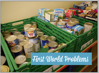
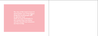
Originally, the idea was to have just a quote on one page and image on the other, hopefully creating enough impact that reader would understand that the image is showing the reality of poverty, while the quote shows the ungratefulness of a 1st world person. however, when this was shown to a few people it was suggested that there should be a fact about food banks so that there is more context to the image. This worked a lot better and made the book have a lot more sense about it.
I printed the first book I designed to work out if point sizes, photos and colours were correct. Unfortunately I printed it wrong so it's hard to read, but this worked well because I could practise stapling it as well. The problems with this book was the font cover, it was too busy with the images and and placement of text.


No comments:
Post a Comment