How bold can bold be?
How light can light be?
How sheer can italic be?
With italic the sheer is the lean on the letter. Normally the sheer is 12 degrees, but I can experiment with how far I can push that and see if it works.
I started with Times New Roman and manipulated it quite simply, but cutting the thick section of the stem down by half.


After working with these in the four types of font I decided that I hadn't gone far enough with the manipulations as they looked pretty much the same.
LIGHT


BOLD


REGULAR


ITALIC


These developments I think are still too safe. They still look like the Times Roman far to much and I think need to change it more. I found it really hard trying to create the italic fonts with trying to make it look right, the C is probably the hardest letter, because of the curve.
So I went back and worked on the original ideas and then how I could change them.
I wanted to make more of the thick stem that is associated with Time Roman. I think it was important to keep that in but update it and change it around. I took the fill out and put lines. I always like adding small details so think this works quite well. I liked the final version I created and decided to go with that and change it from regular to bold italic and light.


ITALIC
FURTHER DEVELOPMENTS
These developments I think are still too safe. They still look like the Times Roman far to much and I think need to change it more. I found it really hard trying to create the italic fonts with trying to make it look right, the C is probably the hardest letter, because of the curve.
So I went back and worked on the original ideas and then how I could change them.
I wanted to make more of the thick stem that is associated with Time Roman. I think it was important to keep that in but update it and change it around. I took the fill out and put lines. I always like adding small details so think this works quite well. I liked the final version I created and decided to go with that and change it from regular to bold italic and light.
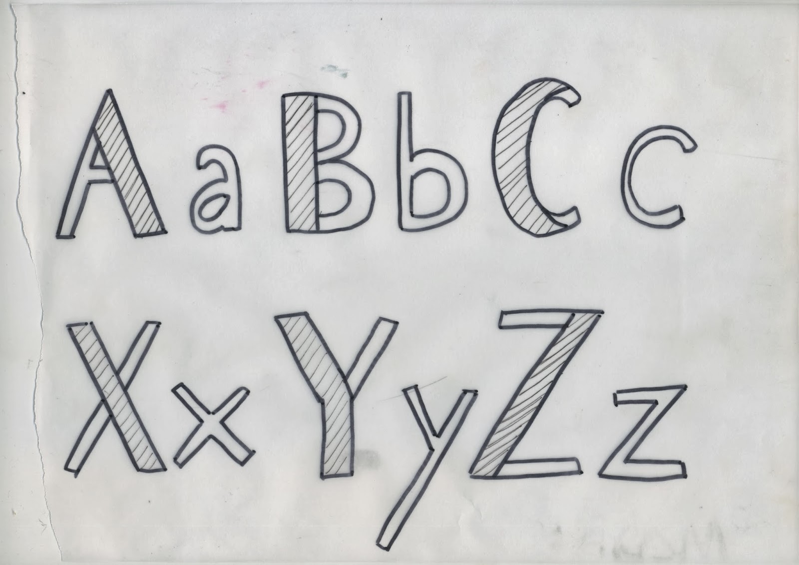
These were the original sketches I scanned in to make into digital. I chose to keep the thick stem to keep the idea of where the typeface originally came from. I chose to put lines in between there because I always think detail is quite interesting and thought it would look good in a typeface.
These are the final digital ones I've created using live trace on illustrator and photoshop.
I like the hand rendered element the live tace has left, it shows that I have actually personally thought about these letters and drawn them.
I went for quite a harsh shear at 15 degrees to make it obvious it is italic, a lot of the time I find you can't really tell it's italic until it's next to regular fonts. So this way it is obvious its italic and I enjoyed pushing boundaries.
I think the bold hasn't worked that well because of the lines in between the gap of the stem, however I still like it because of the hand rendered style. I would change it to a tighter shaper type if I was going to use it at some point.
No comments:
Post a Comment