Tuesday, 19 May 2015
Product, Range and Distribution - Posters
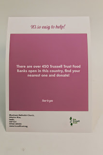
The design style of the book has been carried through to the poster. It's colourful, clean and easy to understand the message. The type hierachy remains, there is a small kind of tagline to grab the attention of a passer by. Then the body text holds a fact, which is the same as the book. On each poster there is the address of the Food Bank I worked with, so people can think about donating, theres a contact number so anyone can ring up if there's any questions and also the website if they want to find out more.
Subscribe to:
Post Comments (Atom)


No comments:
Post a Comment