I was interested in doing a leaflet, a funny one kind of like 'what to expect when your'e expecting' but 'so you're going to be tattooed' or something like that. I thought about listing the top ten things that happen to you when you get tattooed. Such as
- You'll get shaved by a man or woman who is pretty much a stranger
- You'll be in pain
- Cling film will be everywhere
- Someone half naked will be in the room
However when I thought about how I would do this I soon realised I couldn't do a lot visually, I couldn't and didn't really want to take photos of tattoos and I don't think my illustration skills with a tablet or good at all to try create something digitalised.
So I went back into my research and I knew there was a divide in opinions on tattoos, which I could use to create posters with. I wanted to address the discrimination tattooed people have when going for jobs.
I think you shouldn't judge people with tattoos, such as a doctor. If they're qualified and can help you but have tattoos it shouldn't affect anything.
So I looked at high impact posters and from there decided I wanted to use a minimal colour poster with an image and tagline to create an impact people can read quickly.
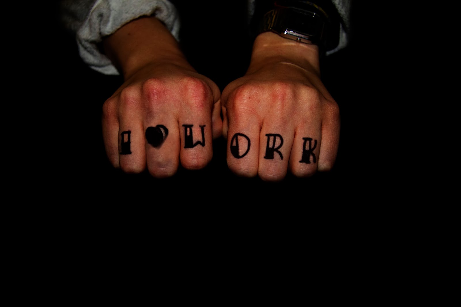
I thought a good way to get a quick message across from a tattooed person would be if I used their fists. Most people have seen tattooed knuckles before and with that I could create one word or two word slogans about employment.
I drew on my friends hand the words in the typical tattoo typeface.


I then edited the background out to all black, I wanted it all black because I was keeping the hands a bright saturated colour so it stand out more. Like this one below.
However, after having conversations with people int he class it was suggested to maybe try black and white, which I thought might not work but when I tried it, I preferred it a lot more.

I think the black and white hands ties the whole thing together and matches the type too. It also makes it look sinister which I think works because it matches the stereotype of the message but when you read it makes it clear you shouldn't judge a book by its cover.
Final Posters


No comments:
Post a Comment