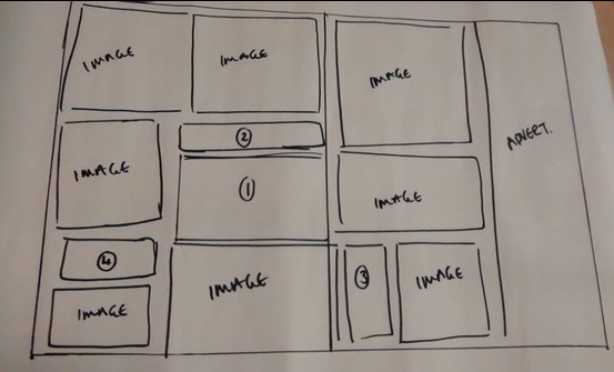
For the type hierarchy we needed to look at a range of magazines, I chose ones that had similar content such as celebrity and fashion but across the price range and stature.
The lowest quality magazine is Love it! it was 65p and writes about some celebrity news, some fashion but a lot of horrible real life stories. This page i looked at was a celebrity based one.
The large quote was the first thing I saw, I think because of its size and content. Then I looked at the smaller piece of text underneath, then the one word titles I think because of the change of colour and size, then my eye went around the page like normal reading from left to right.
The middl range magazine I chose was Reveal, which has a lot more celebrity and fashion in it than love it!, This page was interesting because the title was right in the middle so was drawn to it straight away, and from there my eye went clockwise around the page, looking at the image first then then the text that coincided with it. Because the text is separated into boxes it meant all of it was noticed rather than the names going first then the body copy.
The top of the range type magazine I chose was Hello! This magazine is very heavily image based which made it difficult in finding a decent page to work with. However, the page I did chose was interesting because my eyes were drawn to the big bit of text first rather than a smaller part. I think this is because its against a white background while the rest of the page is navy blue. From there I went to the smaller sentence above and then looked at the images and then captions explaining the images.


No comments:
Post a Comment