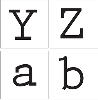
Three Fonts, Visual Literacy
With Design Principles we will look at Type and Grid, Type and Production, Type and Image, Type as image, simple and effective design, the Anatomy of Type, Legibility and Readability, why and how Pantone works, colour theory systematic and subjective colour. a way to get into visual literacy we have been set a task to get three fonts that have different characteristics and styles to one another.
I've chosen
 Prestige Elite Std Bold
 Gill Sans Ultra Bold
 Avenir
I've chosen these fonts because I think they're all different, one is a serif while two are sans serif, one is very bold while one is thin and the other is in the middle. The lower cases are formed quite differently too which I think will help in the workshop.
 Gill Sans Ultra Bold


No comments:
Post a Comment