Thursday, 31 October 2013

Design Principles, Font and Typeface

Letters operate over a spacial element, two lines they sit on.

  • Cap height - Capital letter
  • Baseline, where letters sit
  • x Height, standard height of letters
  • Point Size, from top of cap height and bottom of lowest ascender
Point size

  • 1 point = 1/72 inches = 25.4/72 mm = 0.3527mm
  • 12 points = 1 pica
Font is the production of the letterform, the physical means to make a typeface, via computer, wood metal etc. A font includes  numbers, upper and lower case, punctuation marks, accents, etc, all called glyphs not letters.


Typeface is the design. It's a collection of characters, letters, numbers, symbols, punctuation which has the same distinct design. The characteristics can change within a Type family.

Tuesday, 29 October 2013

Design Principles

Type looks like the way it does because of the way it was produced first.

Stone - to chisel into stone you couldn't go straight in, you had to go on a slant, which creates a bracket seen on Times Roman.

Sable - was a brush stroke with ink which creates the smooth letter form.

Bone - quills created different line weights and stroke.

Wood - blocks of wood create the chunky look and black ink was used, later it was mechanically produced, which was lead based fonts. Upper case and lower case is called that because they literally would be in the upper case and lower case on the shelves.

Metal - mor controllable, different scales, resources, faster production, robust finer type.

Silicone - microchip allowed us to take our type in the digital world which created thousands more typefaces and ideas.

TASK

With the three fonts I chose, we had to group them together with other people's into the 6 different types of font, working out where they originated from.


These were quick manipulations we did as a group to different fonts. It's interesting to see how different people approach ways of changing a letter form. 


Friday, 25 October 2013

Studio Brief 2, Alphabet Soup, Illustrator

Today we were shown round illustrator more, looking at the pen tool, pencil tool and others. It was interesting because I haven't used a lot of the tools, I only ever stuck to simple ones. So knowing how to use more complicated tools and doing them in the quick way will be really helpful when it comes to designing my typeface.


This was just a quick experiment of using the outline stroke of a letter and pulling it in different directions to change the letterform.

Wednesday, 23 October 2013

Studio Brief 4, Message Delivery, Story

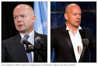
I have chosen to research a story about a baldness cure that has been developed. I think there is a lot of scope for wide research and it is an interesting topic. 
I found the story in the Independent, which is a middle market tabloid and I think is well informed. The tone of voice is serious, it's quite informative and has good quotes from the researchers. 

Sky's report on it isn't very serious, the language is simple and takes a humorous tone. That's surprising because the story is life changing for people and quite a big development in science, I thought they would be a bit more formal about the way they've written it.
http://news.sky.com/story/1157795/baldness-cure-nearer-as-hair-grown-in-a-lab


The top image picks up on the odd and slightly insulting language Sky have used, while the other image show some comments left by readers.

The Metro reports the story in quite simple language, with not a lot of detail or depth. This is expected from a widely circulated free tabloid. Because it is free it's difficult to know who their readers are so  I think that's why the story is reported simply.

BBC News takes a formal and scientific approach to reporting this story, they have written about the processes which happen when hair grows from the follicles  This is expected from BBC to report well and in detail. They have photos like this one showing what cells and follicles look like, which is helpful and interesting. A lot of online stories have links to relating stories which is helpful for further research.

 http://www.bbc.co.uk/news/health-24607696


Tuesday, 22 October 2013

Studio Brief 4 Message and Delivery, Research

The brief is to research into a story in the press from Tuesday 22nd October, I have to buy a newspaper but can look into the story from different papers, websites, reports etc.

Newspaper types
  • Broadsheet
  • Middle Market Tabloid
  • Tabloid
  • Regional Paper
  • Town Papers
  • Free Sheets
Broadsheets
  • Guardian
  • Financial Times
  • Telegraph
  • Times
  • New York Times
  • Washington Post
Tabloids
  • Metro
  • Daily Express
  • Sunday Sport
  • Daily Star
  • Yorkshire Post
  • The Sun
  • Daily Mirror
  • Mirror
  • Independent
  • The People
Websites

  • Reddit
  • This Morning
  • Bing
  • Google
  • BBC News
  • Yahoo
  • Fox
  • ESPN
  • Sky
Programmes
  • BBC News
  • Newsround
  • Sky
  • Russia Today
  • Andrew Marr 
  • The One Show 
  • Mock the week
  • Have I Got News For You
  • Russell Howard's Good News
  • 8 out of 10 Cats
  • This Morning
  • Question Time
  • 10 o'clock news etc


Studio Brief 2 Alphabet Soup Illustrator

Im familiar with Illustrator already because I used the program a lot in my final major project at FE. I hadn't used it over the summer so it was helpful getting introduced to it again. I learned about tools i hadn't used before as well which was a bonus. 

We did quick little tasks like using the Pen tool just so had some practise and could see where we're at. I struggled a little because sometimes when it's in front of other people I forget the basics even though I know them.


Monday, 21 October 2013

Studio Brief 3 Alphabet Soup, Typeface

I got Ashley to write the alphabet and the sentence 'the quick brown fox jumps over the lazy dog' to see what his handwriting looks like, from there and knowing his character more.


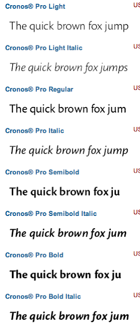
These are the fonts I found that I think suit Ashley, I think he is quite a prim and proper person with neat hand writing, I think these typefaces relay that idea. He is funny and laid back though so I will manipulate the type to make it more like his character rather than the way he comes across.


Friday, 18 October 2013

Studio Brief 1, Alphabet Soup, further Development


After working further into my designs with the crit suggestions, it helped me think of other ideas.

I thought about what stock I wanted to use and realised that the stock could be part of the design rather than just what the design sits on.

My word is capture so I thought that about that in a literal way. The ink can be captured by the stock and with that I played around with stock and how I would let the ink be captured.

Initially I just wrote on toilet paper, because of its absorbency, I wanted to see how the ink would develop into the paper. I liked it but thought you couldn't really see the affect, so I put water onto it and let the ink bleed. I really liked the look of this, I think the colours that are let out are really interesting.


While I was playing around, I put some cartridge paper over the top and printed, I loved this affect. It's like the ink is being captured twice, I really like the texture the print gives out and all the different markings. I used a B for the final watery ink one because I though the curves and corner would be good to let the ink out there.


Three Fonts, Visual Literacy

With Design Principles we will look at Type and Grid, Type and Production, Type and Image, Type as image, simple and effective design, the Anatomy of Type, Legibility and Readability, why and how Pantone works, colour theory systematic and subjective colour. a way to get into visual literacy we have been set a task to get three fonts that have different characteristics and styles to one another.

I've chosen


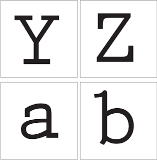
 Prestige Elite Std Bold 


 Gill Sans Ultra Bold


 Avenir 


I've chosen these fonts because I think they're all different, one is a serif while two are sans serif, one is very bold while one is thin and the other is in the middle. The lower cases are formed quite differently too which I think will help in the workshop.

Thursday, 17 October 2013

Studio Brief 3, Alphabet Soup, Typeface

Out task is to create a typeface which represents our partner's characteristics and personality.
Luckily I got Ashley, who i've worked with before so I am already familiar with the he acts. 
We got a series of questions to ask and answer that would allow us to get to know eachother further.

1. When are you happiest?

Out with friends anytime of the day as long as it's outside

2. What is your greatest fear?

Being stabbed

3.What's your favourite place in the world?

Sierra Nevada

4.What's your earliest memory?

I really wanted to walk my grandparents dog but it was a big strong dog and it pulled me away and lost it for a while

5.What's your most embarrassing moment?

Being so drunk I passed out in a friends tent on the beach

6.What makes you unhappy?

Seeing friends and family upset

7.Who would play you in a film?

Alex Pettyfer

8.What's yours favourite smell?

Bacon

9.What's your favourite word?

Burrito

10.What fancy dress would you be?

Walter White/Eisenberg 

11.What's your dream job?

Head of a graphic design firm

12.What's your guilty pleasure?

Ellen Page

13.How do you relax?

Sit and chill with friends

14.What would you change in the past?

Nothing

15.What's your favourite food?

Mum's Paella 

For further research we asked each other what we did at weekends, what music we like, what kind of activities we like doing.


Job- Waiter at weddings and sometimes sets them up

Likes to go out for a drink 
Skate/long boards
Music, Vampire Weekend, Two door cinema club, Everything Everything
Favourite designers, Si Scott and Hydro74
Favourite Font, Haetttenschweiler -Sans Serif 
Top six glyphs - !?@;:7

Monday, 14 October 2013

Studio Brief 1, Alphabet Soup, Crit

Need to think about different production techniques.

  • What stock I will use
  • Emboss or deboss
  • Use a stencil of the letter put it over a camera lens to capture a letter in a odd angle, changing the aperture of the lens
  • Make the letters look like they're moving off the page
  • Try filling them in
  • Stream idea, changing the direction of the stroke
  • Join the S like it's been captured with a rope
  • Negative copy

FURTHER DESIGNS AFTER CRIT

10.

Here i've changed the angle of the Q to represent photography, I wanted to make sure you can still understand what letter it is, I'm not sure about that this one. I think the shape is a bit lost but I may fill it in to create more of a bolder look.


11.

This is the first letter I've done and filled it in, normally I don't like thick and bold type, but I think because i've closed the aperture, as if it'd been captured, it suits it being filled in to create of a clearer typeface.


12.

I've taken the brackets off the capital G to create a sans serif because I wanted it to look quite simple, this letter is about the negative and positive exposure in photography, which I find quite a complicated process. 


13.

I wanted to play around with the letter L because I could see how extending the brackets up would create the idea of space being captured. Unfortunately, I think it looks really bad and not even like an L.


14.

I've created a gap between the neck of the g to create an aperture to show a catch and movement. I blocked it in to make it clearer and quite like this manipulation.


15. 

One of the other meanings for capture is when a river bed changes the route of the river, so I tried this with a K and Y and think it's quite interesting, I think i'll carry this on for one the final variations. 


Studio Brief 1, Alphabet Soup, Initial Designs

After researching into my word and into the font I began with simple adjustments to some letters I picked. 

1.
I've chosen letters that I think work best with my ideas, such as a capital E. I could see how I would create the idea of capture with the brackets of the letter, I've extended them to create more of an enclosed space, as if that space had been captured.


2. 
Here I've extended the brackets right down to the opposite line of the Z and W because I was thinking of those brackets reaching out and capturing the opponents territory, like in Chess.


3.
With the T I took off the brackets to create a Sans Serif type because I saw it as taking away the brackets captured the Serif.


4. 
I separated the spine of the S with the matching angles of the brackets as if those angles had separated the spine and captured each half. I like this idea and may bring further by playing around with the idea of rope and each bracket being literally caught.


5.
I've separated the A like the S and took off the brackets to create a Sans Serif to follow the T to see what that looks like and if the A holds up on its own. I like the look of this quite a lot I think it's interesting and communicates the idea of capture.


6.
I chose to look at a smaller case 't' because I could see how the tail of the t could curl up and create the idea of something being held, like what was said in my brain storm. 


7.
I was thinking of capturing in the context of photography and thought about the colours used, so if i were to use colours which one if any? I personally don't like this one and don't want to use colour because I think it looks underdeveloped and tacky.


8.
I was thinking of photography and ways the camera shows things, so thought of picking a letter like P and zooming in on it, like a close up shot. I think P works well because even close up it's still easy to see what it is. 


9.
I thought of the idea of things capturing each other, as if they were catching each other and need one another to survive. So with this A I took the crossbar out, which is normally quite vital and let the other sides fall to each other. The brackets work on this one because that looks like more support for the two sides.