Friday, 22 May 2015
Design Practice Module Evaluation
This last module was a good one to work on because it wasn't as intensive as past ones meaning I had time to work properly and feel I have finished the year successfully. I enjoyed working on a brief with a set research task, because I need practise with researching, but here I think I've used it well. It developed my idea and changed the outcome for Product, Range and Distribution which was interesting to work on. For Covered, I chose a topic I'm already interested in which made working on it fun and I was dedicated to it. This is important to keep in mind for next year, so that I don't get stuck doing briefs I'm not interested in. With the Product, Range and Distribution brief I was inspired to use a lot of colour by Aimee. I don't normally used loads of colour but I think the campaign looked a lot better with a lot more colour. I want to remember this apply it to future work. If I was to work on this module again I would of researched further into publication types for PRD. I had in my head the small book from quite early on, but I think if I had looked at a range of prints and finishes the book could be better. As for covered I'm happy with the finals, however it would of been good if I had ordered the right stock from GF Smith and used that to print on. I also think it was a good move not to screen print, the design didn't need it and it would not of been a good use of time. Next year I hope to work on briefs like I did with this module, I used my time well, I researched effectively, designed work that I like and worked on a topic that really interested me.
Thursday, 21 May 2015
Product, Range and Distribution - Evaluation
This brief was really interesting to work on. It began very differently to the way it ended which I think is good because it should work like that, the research leads the ideas. There was a lot of research with this brief because it was in two parts. The original idea was changed because of a suggestion in a crit. Rather than linking quotes with images of amazing food, link it with poverty. I chose to go local in Leeds because charity begins at home and could do something for the food banks if its near by. This gave the book and other material a lot more substance and reasoning for creation. It was good to leave the studio and go to the food bank and talk to people about what a food bank is. This sort of information provided true and honest content which is important because of the topic. It helped the tone of the campaign as well, it is useful, friendly and informative in a non aggressive way. Overall I think I researched effectively and properly which is good practise for the summer and with dissertation coming up. My time management was also really good on this brief. The only time I could go to the bank was a week before deadline, but three days before my print slot. So because of the time constraints I had to work cleverly. I prepared my document and thought out how I wanted to put it all together. Since I planned everything, it all worked out well. The only thing I would of changed is my thoughts about the range of products etc. I didn't really realise the brief till quite late on, I could of done better more in depth research on what to create along side this book in order for it to be most effective. Having said that I think the supporting printed material is good and fits well with the book.
Covered - Evaluation
I worked quite effectively on this brief. I think this was down to the book I chose. I decided to use The Communist Manifesto because I'm really interested in Communism and already know some stuff about it. With the knowledge I knew and having read some of the book, it was easy to generate ideas. I was interested in the research as well which I think helped the design a lot more, because every part of the design is justified and to do with the book. I think this brief has been really successful and that's because I was designing for something I'm interested in. With other modules the work has suffered because I wasn't really bothered about the topic but with third year coming up it's taught me to really think about the work I chose for myself. The briefs have to interest me a lot so that I can produce the best work. My time management was really good on this brief as well, I was finished before the deadline which is odd but I think this is down to planning my time. Having booked print slots well in advance benefitted me a lot and freed up time for the other work. The only thing I would of changed with this brief is the ideas process. The research developed my idea quite a lot which is good but I didn't really think about a lot of other ideas before going with the one I chose. I don't think that is that major because the research really gave me this idea rather than me just storming ahead with one idea I've just thought of. I finally did some decent research which gave me a very thought out idea.I have enjoyed this brief a lot because I got to choose what I wanted to do which is good practise for next year.
Tuesday, 19 May 2015
Product, Range and Distribution - Postcards
The postcards follow the same design as the other printed material. On the front of the postcard is the main title of this project, 'First World Problems', it then has half a quote from a first world problem, then on the back it finishes off. This is so the reader has to turn it over and find out a fact about food banks in Leeds and find out how to help.
These are quick little ways to spread the message of this small campaign to people of Leeds.


Product, Range and Distribution - Posters
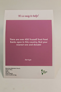
The design style of the book has been carried through to the poster. It's colourful, clean and easy to understand the message. The type hierachy remains, there is a small kind of tagline to grab the attention of a passer by. Then the body text holds a fact, which is the same as the book. On each poster there is the address of the Food Bank I worked with, so people can think about donating, theres a contact number so anyone can ring up if there's any questions and also the website if they want to find out more.


Product, Range and Distribution - Final Book Design
The book has come out really well. It was printed on the a normal stock, this is because if it was to go further and be printed throughout Leeds, stock is somewhere to save money. The book will cost a bit to print because of the amount of colour, if this was a problem the colour can come out but that is only if this was to go further. The choice of binding as well has this idea in mind, using staples is a quick and cheap which works well for further distribution.
The book has an explanation of itself at the front, a thank you and encouragement note at the back for readers and the Trussells Trust Food Bank. On the back is the logo and website, with no colour so that it's clean and clear on the outside.


Product, Range and Distribution - Purpose
Product
A small 11cm by 15cm book.
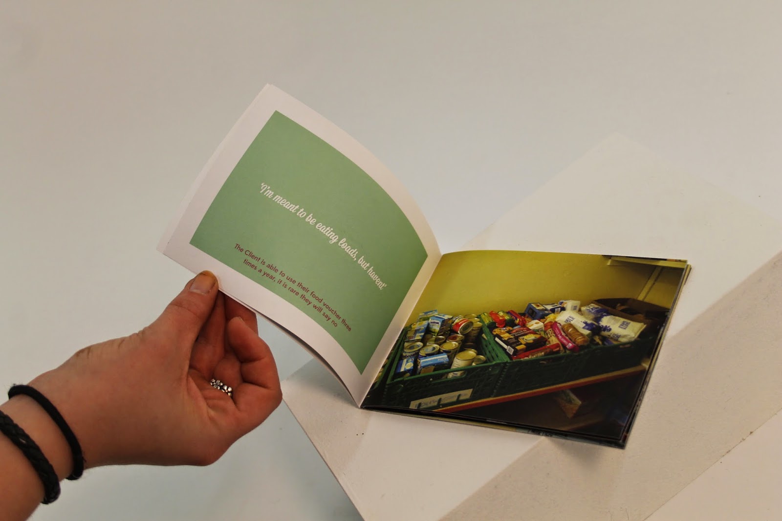
It will have full bleed image on the right side page and on the left have a quote to relate to the image. The image is the illustrating the fact that there is poverty very near by. The quotes will coincide to point out how 1st world people take things for granted.
The audience is local Leeds people, this is because the images and information are from a local Leeds food bank and keeping it local means there's a chance people will actually get involved and help.
There will be supporting printed media to go along with the book. This will extend the project and become a small campaign for awareness and donations to local Leeds food banks.
Range
Along with the book supported printed media is needed. The book can be placed in appropriate places to be sold, the supporting media can be distributed around Leeds. Posters will work well to create interest and awareness to the cause.
Postcards are a fun way to do the same but with more of a personal touch. Postcards can be put in places like cafes and food shops which could create a food drive to support the food bank.
Distribution
The book will be placed around local book stores, food stores and cafes. They need to be in places that sell food and drink so that people have time to pick it up, donate some money for it and have a look through it. There isn't a fixed price because the reader can pay what they want for it, promoting donations.
Posters can be placed around the city centre, where there is a lot of foot traffic. This is so people can see it and find out what it's about after, as there is information on the posters.
Postcards are free and will be placed around the city as well, but more in cafes and bars where there is time to read it and possibly find out more. If people are sitting around and talking while looking at the book and postcards it could create the conversation of doing something about the problem, donating etc.
A small 11cm by 15cm book.
It will have full bleed image on the right side page and on the left have a quote to relate to the image. The image is the illustrating the fact that there is poverty very near by. The quotes will coincide to point out how 1st world people take things for granted.
The audience is local Leeds people, this is because the images and information are from a local Leeds food bank and keeping it local means there's a chance people will actually get involved and help.
There will be supporting printed media to go along with the book. This will extend the project and become a small campaign for awareness and donations to local Leeds food banks.
Range
Along with the book supported printed media is needed. The book can be placed in appropriate places to be sold, the supporting media can be distributed around Leeds. Posters will work well to create interest and awareness to the cause.
Postcards are a fun way to do the same but with more of a personal touch. Postcards can be put in places like cafes and food shops which could create a food drive to support the food bank.
Distribution
The book will be placed around local book stores, food stores and cafes. They need to be in places that sell food and drink so that people have time to pick it up, donate some money for it and have a look through it. There isn't a fixed price because the reader can pay what they want for it, promoting donations.
Posters can be placed around the city centre, where there is a lot of foot traffic. This is so people can see it and find out what it's about after, as there is information on the posters.
Postcards are free and will be placed around the city as well, but more in cafes and bars where there is time to read it and possibly find out more. If people are sitting around and talking while looking at the book and postcards it could create the conversation of doing something about the problem, donating etc.
Product, Range and Distribution - Book Designs
From looking at novelty books in Urban Outfitters making the book a small size made sense for two reasons, it makes the publication a bit more fun and engaging. Also, it will be easier to distribute, people are probably more inclined to pick up a small pocket book rather than a large magazine style publication.
The choice of type is important because it needed to communicate the idea of 1st world living. Looked at some script fonts which at times where too decorative and fancy. The one which has been used, Mission Script is modern and a popular style. It needs to be fashionable and good too look at so people are interested in looking at the products. The main font is Mission Script and the body text is Edmonds Sans, a simple font with small quirks.


The document was already set up in the correct size a few days earlier to getting the photos and interview. After deciding the fonts it was a simple case of putting in the photos and working out the colours and placement. Decided to use a lot of colour because this publication needed to look exciting and friendly. If there wasn't a lot of colour it would be simple and cold, which isn't very enthusiastic and encouraging which this publication needs to be. The colours are linked to the image, so that it isn't clashy and hard to look at.


Originally, the idea was to have just a quote on one page and image on the other, hopefully creating enough impact that reader would understand that the image is showing the reality of poverty, while the quote shows the ungratefulness of a 1st world person. however, when this was shown to a few people it was suggested that there should be a fact about food banks so that there is more context to the image. This worked a lot better and made the book have a lot more sense about it.


I printed the first book I designed to work out if point sizes, photos and colours were correct. Unfortunately I printed it wrong so it's hard to read, but this worked well because I could practise stapling it as well. The problems with this book was the font cover, it was too busy with the images and and placement of text.


Monday, 18 May 2015
Product, Range and Distribution - Book Research
The research in the first part of this brief has lead to the idea of producing a book and supporting material.Producing a book consolidates all the stuff that has been researched and collected, quotes, images and facts. The purpose for this book, which is to inform and educate people will be illustrated through images and small amount of text.
Having the images full bleed will make a big impact and relate to the silly quote and then a fact about the food bank industry, hopefully this will show the reader how 1st world people take food for granted. The quote will be the centre of the page to hold the type hierarchy, as the reader is expecting that in the book, then the quote will be elsewhere on the page, to be read second and make more of an impact.
The book needs to be friendly and entertaining so that readers will look at it. Much like Urban Outfitters books. They're entertaining and good to have a quick look at.The book will be similar to this but with more of a purpose.


Product, Range and Distribution - Trussell Trust Food Banks
There are four food bank distribution sites in the near by area of central Leeds. I contacted Karen Burgon who is the Project Manager for West Leeds Trussell Trust Food Banks. After explaining why I was getting in touch she was more than happy to help and welcomed me to visit.
Food Banks are only open a few hours in a day once a week, so arranging a time was difficult. We had to meet on Friday which meant I had 3 days till my print slot to put the publication together. This was fine because I had designed the document, just had to add photos. I have planned this brief well meaning it's ready well before the deadline.
Interview with Karen
What does a food bank do?
The client comes in, gets a cup of tea or coffee with biscuits. A volunteer will look at what their slip says and goes and gets the food correct to them.
A councillor is there to chat to them about any problems the client might have. There are volunteers there that can talk to the client about anything while they wait for their food.
There a different requirements per person, dietary restriction, amount of kids, any pets etc are all taken into account. Trussell Trust collect all this data so that they can keep a record of food bank trends throughout the country.
Burley Warehouse is the main food holding area, then projects managers etc receive the food in smaller distribution places such as churches or community centres.
How many food banks in leeds and in this country?
There are 450 Trussell Trust in the country and 4 in the Leeds area.
Who is involved?
There is a public donation of food normally. Trussell Trust started between churches in 2012 and takes about 9 months to organise the firs tone. Anyone can volunteer, there is an interview with references and they have to be confidential.
What's the limit for the client? Is there a difference between each person?
The system used to be that the client would get 3 food vouchers a year, then it was 3 times a month and now it is 3 times in a crisis. So the situation is looked at and analysed.
How do you promote for donations for the food bank?
There is a small group of volunteers that promote the food bank on social media sites. Local schools are really supportive and get involved regularly. Trinity uni are involved with the media course. There are events every two months.
Are food banks struggling for donations?
West Leeds food bank aren't struggling because it is nice area. Ones in poorer obviously do a bit worse. There is a food drive in Tesco stores across the country which do really well. There are over 200 volunteers in Leeds.
This interview has helped with production of the publication. The original idea of having a small book with quote on one page and full bleed on opposite still stands. However, there should be a linking fact to the quote to give context and make the reader will understand the point of the publication. To promote food banks and teach 1st worlders about them and make them want to get involved.
Thursday, 14 May 2015
Covered - Final Designs
Poster
The poster is finished with two colour, red stock and black shapes and text. It was deiced not to use screen printing for the poster because it is too long a process. The white text didn't define the design so was worth changing the print and making it digital.
The concept of the poster is well thought because everything is designed with Communism in mind, to the left, everything equal bar one main power and one main thing the eye will look at.

Book Cover
The book cover is the same as the poster and will be printed on the same red stock as the poster. The blurb, logo, ISBN number and bar code are all justified to the left with nearly the same width as the 'CM's so everything is equal.


Thursday, 7 May 2015
Study Task 04 - Vote
We decided that in order to get a younger generation involved in voting we needed a generation appropriate solution.
VAP - Voting App is a downloadable mobile app that people can securely sign into, to vote, read about each party, get a simple, full and unbiased understanding of what each party stands for.
The tone of voice is friendly and informative, the policies and histories of the parties are put into simple terms, so that anyone can understand what it all means. The information is purely to inform people, so everything is fair and not implying any opinions.

Friday, 1 May 2015
Covered - Further Development
After the suggestions from peers, it was apparent that designing for a Communist book that it would work better if it did look classically communist.
However, I did experiment with a series of colours quickly to see if any would work. All in all red is the colour to use, it demonstrates the book and people can relate to it quickly. If this book was being sold a consumer would recognise this and understand the content making it more commercially viable.
After more discussions, blocking the letter M worked a lot better for the peers looking at it. It creates more of a pattern and is more eye catching.


These designs have abandoned the idea of moving away from red, and instead making it look hardcore communist. It was suggested that screen printing red on red may look interesting and add another level and depth to the design.
All of the design has been justified to the left, to represent the political standing of Communism. To further that the last column of the CM on the right were taken off, this works more because of the negative space. That brings the eye more to the left and doesn't overpower the design.
There was experiments with colour of stroke, background colour, type colour and weight this is to work out what is the most suitable design.


This design will be the final design - so far - with the black outline, white text and red background. This design is sharper then the above one with the red outline, making it easier to see because it is A4 size. Screen printing this onto red stock will dull the colours slightly, however it gives a nice finish to the poster and is worth doing.


Experiments with colouring with text show the white is best colour to use. It is more visible and gives some hierarchy to the design.
Subscribe to:
Comments (Atom)