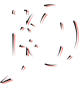
I started by stripping back the design to get rid of all the colours and look at the shape and overall design. However I prefer to work by hand, so stripped it back more by hand. This helped because I was able to draw a few roughs out and think about what I wanted to do before I did it on the computer.
Here I used the original colours of the art work for the lines, I like it, it definitely proves I need to use colour. But it doesn't have to be in this way and not the same colours.
I then played with a drop shadow, to create more shape and add colour to the design. Varied the colours from the flavours and original
I then thought of using watercolour to add texture and create a fusion, like the fusion of the flavours. For this prototype I used an image of google, however, if i go for this design I will make my own watercolour that really communicates the flavours.
Using other colours to demonstrate the other flavours.
I drew this outline up in order to have the colours around the logo. Making the shape a well known one and very recognisable.
Began by seeing the outline of the shape with a basic colour.
I added the background and cut round the edges
Discovered the clipping mask technique which create a much neater look.
I added the white to the 2 because I think thats the most significant part of the logo. It's a number rather than a letter and stands out the most.


No comments:
Post a Comment