I think jewellery is something people look after and but in special boxes like photos, so chose to use an image of a necklace or even the tiny chain to communicate this.
These are mock ups of that idea. I haven't spent a lot of time on them because while I was taking the photos I thought of another idea I really wanted to do and spend time on.
Another idea!
I'm going to use flowers to show delicacy but make them worn with interesting colours to show how people change the image all the time but the frame stays the same. Because the frame lasts longer than the image.
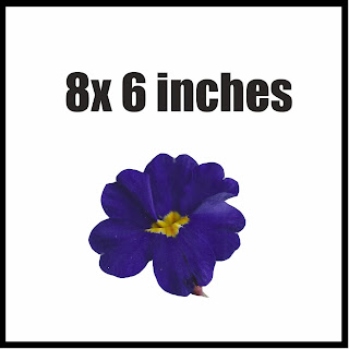
I took some flowers and scanned them in the computer as if they had been pressed, to get texture in the image because I find texture really interesting and good to look at. Scanning them will leave a more impressive image than a photograph.
Initially I was going to just have one flower on each frame, trying to show how precious it is, but decided that didn't look that interesting and eye catching.
I've put a border around it so you can it properly on the blog. I chose to keep it white background to show the cleanness,because if its in a frame it's clean, looked after and protected.
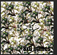
While playing around with that idea I decided to repeat image and create a pattern, so it's more eye catching.


These are all the designs I went through before I came to my final outcome. I really like the repeat of the flowers because they create texture which reminds me of when photos become worn. That's also why I chose to use curves adjustment to create the exposed look. I started with the purple image, at first it was like the bottom ones, where they're quite warm. I didn't think the warmness suited the effect I was trying to produce. So by using the curves and levels I changed the colours to more cold colours.
Final Three
I'm really happy with the look of these designs. I think they stand out and will make someone look at them.
I think my concept of photos being changed all the time but the frame staying the same can be seen because of the effect I've put on. I've targeted women with these designs and I think probably young girls like my age. I can see grown women looking at these and thinking they're nice for them as well.


No comments:
Post a Comment