Monday, 30 December 2013

Type Journal, 3


I'm interested in tattoos and folllow some very good artists on Instagram. These little bits of type are from an artist called Luke Wessman. For tagging, and some inside group type of tattoos he used this typeface I think he created. It's normally very square, and quite hard to read. It is very typical of his Californian gangster type of tattoo and works well with some of his tattoos.

Type Journal, 2


I came across this old sign in Leeds City Library, which on it's own is an amazing to look around!
The design of the sign fits right into the look of the library, it's so old and used. It reminded me of Hogwarts.  On this type, I really like the shape of the letters, they're quite peculiar. The serif have a weird curved shape on them which you don't see a lot of, it reminds me of the 70's.  For a command type of sign I think the typeface is quite funky and laid back, normally it would be in capitals or at least straight lines. 

Wednesday, 11 December 2013

Design Principles, Hierarchy, Newspaper


In this exercise we looked at newspapers and the hierarchy of type used. We had to cut out what we saw first and go down to the last thing we looked at. A lot of the time we fell into the tricks of the editor, like looking at the images, then deciding with we would read the article or  not.


For this task we had to look at a newspaper article and straight away cut out what we saw first, second, third and so on till there was none left. This was an experiment to see if we fell into the editors tricks of seeing the things they want you to see first. I think most people fell into the traps because of the way it is layed out, what is next to what. Its all about how your eye reads, which is actually right to left rather than left to right. 


These are the way the newspaper was at the start and the final image of how I saw the type first and last. This task is difficult to get used to but helps me see how editors use layout and type to move the readers eye around the page.


Design Principles, Quick Fox

One of the tasks we had to do was use the four words 'the quick brown fox' and see how we can manipulate them and still make it readable from beginning of the sentence to the end. We also had to use all four fonts, gothic, roman, script and block for each word and swap them around, still trying to keep the order correct. 
This task was about hierarchy and readability, and was harder than I thought!


 All the above manipulations were done in capitals, I did this so all the letters were technically equal, and one wouldn't jump out obviously. However that changes when you apply different fonts to the words. 


These manipulations were done in lower case letters for the same reasons as the above, trying to keep it all equal level. It also allows you to play around a bit more if they are technically equal.


These are manipulations I made to the four words, where I was playing around with their position and sizing of the letters within a box to see if it changes the way you read the sentence. 

I found it hard trying to position it so you read 'the' first, but it was quite fun working with how people read things. Like the face of a clock, the direction that goes or how you're supposed to read left to right, it sometimes is easier to read right to left. 

Thursday, 5 December 2013

Studio Brief 1, Design Process, Another concept

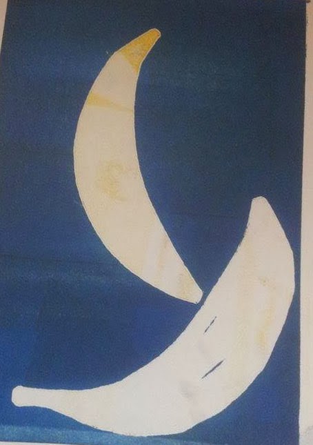
I want to show how people protect their delicate photos in frames, for me frames are like boxes that preserve the memories. So I thought of trying to show that with delicate things that need encasing.

I think jewellery is something people look after and but in special boxes like photos, so chose to use an image of a necklace or even the tiny chain to communicate this.


These are mock ups of that idea. I haven't spent a lot of time on them because while I was taking the photos I thought of another idea I really wanted to do and spend time on.


Another idea! 

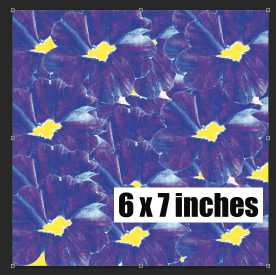
I'm going to use flowers to show delicacy but make them worn with interesting colours to show how people change the image all the time but the frame stays the same. Because the frame lasts longer than the image.

I took some flowers and scanned them in the computer as if they had been pressed, to get texture in the image because I find texture really interesting and good to look at. Scanning them will leave a more impressive image than a photograph. 

Initially I was going to just have one flower on each frame, trying to show how precious it is, but decided that didn't look that interesting and eye catching.

I've put a border around it so you can it properly on the blog. I chose to keep it white background to show the cleanness,because if its in a frame it's clean, looked after and protected. 

While playing around with that idea I decided to repeat image and create a pattern, so it's more eye catching. 


These are all the designs I went through before I came to my final outcome. I really like the repeat of the flowers because they create texture which reminds me of when photos become worn. That's also why I chose to use curves adjustment to create the exposed look. I started with the purple image, at first it was like the bottom ones, where they're quite warm. I didn't think the warmness suited the effect I was trying to produce. So by using the curves and levels I changed the colours to more cold colours. 


Final Three


I'm really happy with the look of these designs. I think they stand out and will make someone look at them.
I think my concept of photos being changed all the time but the frame staying the same can be seen because of the effect I've put on. I've targeted women with these designs and I think probably young girls like my age. I can see grown women looking at these and thinking they're nice for them as well.

Studio Brief 1, Design Process, Concept 1

I still liked the idea of showing someones life through images and layering them. I imagined it to work well and look eye catching. However when I went to create the images, it didn't work.

I made really scary images.

I used three photos of my sister, from when she was a baby, mid teens and now at 21 to show the way she'
s grown. I think the photos in frames always change so wanted to show this with one person.
It definitely doesn't work. It's too personal, no one knows who this is and wont really affect someone. I also think it's just really creepy and doesn't work in colour or black and white.


 I also did it for myself and think its probably worse! I'm glad I tried this though because it means i need to think of something new and that will work.


Tuesday, 26 November 2013

Type Journal, 1


TYPE JOURNAL


This is a logo designed by Hyrdo Seven Four, a graphic designer from America. He's a very talented graphic illustrator so it was interesting to see him design with type. I don't think type is his strongest, I like the flowing shapes but for a logo I think its too much. It's unreadable and for me personally doesn't make me want to work out what it says to work out what the company is. This is like an example of an illustrator attempting typography and going wrong.

His more successful illustrator work


I came across this old sign in Leeds City Library, which on it's own is an amazing to look around!
The design of the sign fits right into the look of the library, it's so old and used. It reminded me of Hogwarts.  On this type, I really like the shape of the letters, they're quite peculiar. The serif have a weird curved shape on them which you don't see a lot of, it reminds me of the 70's.  For a command type of sign I think the typeface is quite funky and laid back, normally it would be in capitals or at least straight lines. 

Thursday, 21 November 2013

Design Principles, Readabilty Vs. Legibilty

We were asked to bring in 'The quick brown fox jumps over the lazy dog' in upper and lower case in the four different font categories.

Using these we decided which were easiest to read down to hardest, individually, then as a table and finally as a class.

I decided that script was hardest to read and gothic was the easiest.


  • Gothic was easiest because they have wider letters, no serifs, easy clean curves, wider letters and larger gaps between the letters making them easier to read. 


  • Script is all joined up and too close, with decorative or serifs.


  • Block is thick and close together, which makes it hard to read.


  • Serifs are in the middle, when type with serifs are used in body copy it becomes a lot easier than when they are on a larger part of text. 
  • Bigger bowls and counters make it easier to read, this is because we naturally look at those to recognise the letter rather than the stroke.
  • Roman fonts can be defined after a while whereas gothic fonts can be muddled up.
  • Serifs work better in lowercase and sans work better in uppercase
What makes something readable

  • Tracking, contrast in glyphs, kerning depending on font, size of bowls, counters and x height.
  • Gothic and Roman fonts are normally body copy, easy to read on a small scale
  • Counters are the most important part of the text
Legibility is the degree to which glyphs in text are understandable based on appearance

  • Kerning - space between two letters, it affects legibility of individual letterforms
  • Leading - space between lines above and below
  • Tracking - spacing letters out
  • Readability - ease in which text can be understood/read

Design Principles, Manipulating Type


One of our tasks were to manipulate some of the letters we had brought in, in any way. We could add to them or take away. I brought a Roman font in, Times New Roman. So I chose to cut the heavier line down to create a more even line weight throughout the letters.

Maniupulating type by hand really helps to get an idea of how you want to look before you put it on the computer. This way you have quite a lot of freedom to play around with the letterform before you decide if it will work or not. 


Thursday, 14 November 2013

Module Evaluation

I enjoyed this module because I'm quite interested in typography and the detail of it. It was a good way into the course because typography is so important in design, I think it will benefit my future work.
Designing a typeface for someone else was also really good because it meant getting to know people and challenging myself to really communicate Ashley's character. I think it was quite hard at times trying to work out how to do that but I'm happy with the result.
I really enjoyed the poster design brief because I enjoy making high impact posters, especially with catchy slogans. That let me put some of my personality and character in to my work a lot more obviously than the alphabet briefs.
Overall I am pleased with the way the first module has gone for me, I'm looking forward to moving onto new things and learning more about the industry. 

Mono print Induction

We went down to Rossington street to be shown how to mono print. I have mono printed before but quite a while ago so it was good to relearn the basics and have a go. At the time I didn't have any ideas for briefs that would benefit from mono print so I just cut some shapes out and used them. 


This is what was on the board after printing onto paper,which I thought was interesting. I like the colour contrast and texture in it.


I put some cut out shapes over the edge so that when it prints you can see where the lines of the board were and gives a good effect.


These are the prints that I produced during the induction. I really enjoyed seeing the results of the ink on different stock. The tracing paper was my favourite because it gave a opaque effect and the texture was interesting. The shapes I cut out were completely random, I don't know why I chose a banana.